Korina Mavrokordatou: Data Visualisation Portfolio
ECON30006 | Student Number: 1941182
Week 1: Introduction/ Embedding
Embed three charts, two that are given to you in class. One (as homework) taken from the repository of charts that drive www.rapidcharts.io:
Covid-19 Cases by region, UK
This is my first chart, an interactive line chart
showing Covid-19 cases in the UK by region embeded from class.
Labour Productivity, UK
This is my second chart, a line chart showing
UK labour productivity from 1971 to 2021 embeded from class.
Gun Deaths and Income, US states
This is my third chart, a scatter diagram showing the relationship between median income
and firearm deaths in the US embeded the repository that drive www.rapidcharts.io.
Week 2: Hosting data
Embed two charts of your own design: (a) from a given API, (b) from the same/related data saved to your GitHub:
Number of New Deaths by Covid-19, UK
This is my fourth chart which consists of 2 lines for Birmingham and Leeds,
the two most populated districts of England, from gov.uk's coronavirus API
accessed through https://coronavirus.data.gov.uk/details/download.
Number of New Cases of Covid-19, UK
This is my fourth chart a complementary chart for Birmingham and Leeds,
showing the number of new cases. Data has also been accessed from
through https://coronavirus.data.gov.uk/details/download but has been
downloaded and stored on my github page as a csv file.
Week 3: Editing data, writing JSON by hand
Two more charts. One where you change (add an observation); One where the data is “in-line” JSON that you write:
Number of species on "red list"
This is my sixth chart, a bar chart showing endangered species.
The data is "in-line" JSON, which I have manually written.
The data (csv file) was downloaded from RDeconomist on Github.
Then, using Vega-lite online, I recreated the chart.
Data manually written.
International Student Statistics, UK
This is my seventh chart, a bar chart showing the number of international students
studying in the UK. The data was collected from "Studying-in-UK.org"
and I have added data for the University of Bristol and the
University of Bath from another source, in excel.
Week 4: API driven charts
Embed two charts of your own design from two separate APIs that you sign up for & gain access to:
Goals Scored in Football, Cyprus
This is my eighth chart, a scatter plot showing the number of goals scored
in Cyprus 1st division league. The chart was created using an API key
from SportsDataApi for which I requested access for. I manipulated the API link
and changed the time-period to include the last season (21/08/2021-23/11/2021).
Note: Visualisation does not work in Safari but works fine in Google Chrome browser.
I tried googling the problem but no solutions/reasons for the problem were found.
Ozone concentration, Portugal
Pollution data using satellite imagary from emissions API. The chart makes two
separate API calls, one to get Portugal data, and one to get the data
for a specific point, in this case the coordinates for the city of Lisbon. No API key was required for access.
Data url for Portugal.
Data url for Lisbon.
Coin API, World
Bitcoin exchange high and low rates data. The chart makes an API call using a unique API key,
from coinapi from which I requested access for.
Week 5: API fetch
Download code from an API using fetch in Python/Colab and chart this. Uses a loop so that you can create a dashboard:
These charts are US based data that shows the trend of Federal Funds Effective Rate, Unemployment Rate, Real Gross National Product and Industrial Production Total Index. The data for these were batch downloaded using a loop in Colab.
Week 7: Data Scrapers
Build a scraper in Colab, save and chart the results:
University Overall Scores, UK
This chart was created by scraping data from Prevalence of dementia in Europe using Google Colab, where I
recreated a table for the estimated prevalence of dementia in different countries in Europe, in 2018 and 2050.
Week 8: Data Stories: Talking Economics
Attend one (or more) mornings of Talking Economics. After this construct a chart that would (a) support or (b) refute an argument that is made there:
Coronavirus and Depression in Adults by Age and Gender, UK
This chart was created to support Professor's Sarah Smith statement that "During the pandemic, women’s
and especially younger women's mental health suffered more than men’s mental health". Data was
downloaded from the ONS and it is clear that the group with the highest proportion of adults experiencing
some form of depression is young women, aged 16-29.
Week 9: Advanced Analytics
Chart data from two separate sources. Plot these data using a more advanced technique (correlation, regression, distribution, etc):
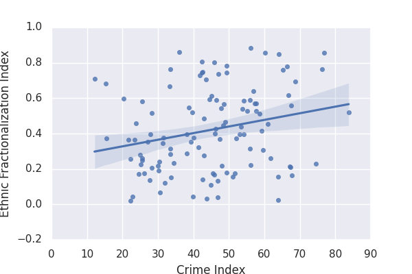
Crime and Ethnic Fractionalization Indices, World
This chart was created from 2 different sources, merged in Stata. It examines whether countries which
are more ethnically diverse experience higher crime rates. The regression was performed in Google Colab.
Dofile for Ethnic fractionalization Data

Week 10: Interactivity
Build and embed an interactive chart (sliders, clickable legends, drop down boxes, zoom and scroll etc):
Girls of primary school age who are out-of-school, World
This chart was built on vegalite. I have added a binder
that allows you to select a start date and a tooltip
which shows the number of girls out of school for every region,
and year.
Girls of primary school age who are out-of-school, World
This is my second interactive chart, a complementary chart with
value labels for each region and year.